Content Cards
Documentation
Content Cards

Card Layout
Inside the Fetch app, families and model groups are laid out on individual “cards.” These cards, when expanded contain and graphically display information about the models in the library including (1) title header, (2) title sub-header, (3) favorite button, (4) 3-dot pull-down menu, (5) update notification, (6) properties icons, (7) file name, (8) file size, and (9) descriptive text.
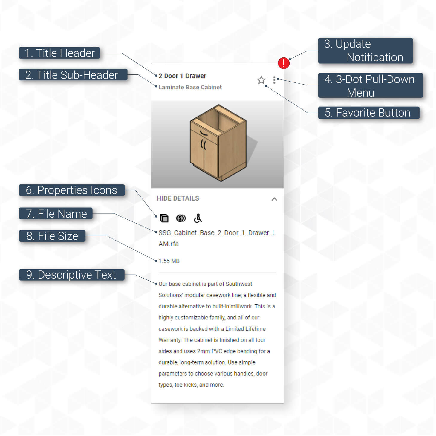
- 1. Title Header: This drop-down menu quickly shows the account that is currently signed in and gives buttons to access account management or to sign out.
- 2. Title Sub-Header: The sub-header is used to group similar families together. For example, a group of similar laminate casework families will have the title sub-header of “Modular Laminate Casework.”
- 3. Update Notification: When a family is available to update, a red exclamation mark icon will appear in the top right-hand corner of the card. For more information, visit the Content Management chapter of this documentation.
- 4. 3-Dot Pull-Down Menu: This menu can be used as an alternate method to insert, favorite, and update models. This menu also contains other pertinent information not graphically included on the card including CSI specs, finish options, spec manuals, and material libraries available for download. The “Learn More” option at the bottom will open a new browser tab of the product page on the FetchBIM site.
- 5. Favorite Button: To quickly save frequently used models into an easy to find location, click the favorite star button. This will add the selected card to your favorites tab. Any object with a card can be added to the favorites tab including families, model groups, tags, schedules, and project templates. To learn more about the favorites tab, visit this section of the Navigating Fetch chapter on tabs.
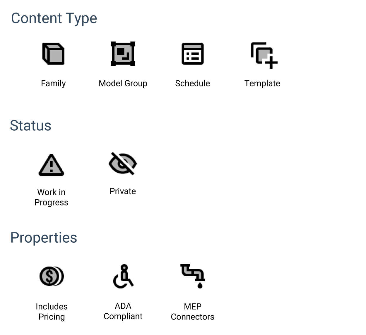
- 6. Properties Icons: These icons can help a user see at-a-glace more information about a model. Icons are the same as the website. Content Type icons denote what a model is be it family, model group, or schedule. Status icons can alert you to what stage of production a model is in. Work in Progress models are only visible to the content creation team while private models will only be visible to select groups. Public models will not display a status icon. The properties icons give more detailed information about a models capabilities and included data.
- 7. File Name: The actual file name of the model.
- 8. File Size: The actual file size of the model.
- 9. Long Description A 2-3 sentence description of the selected model. Will often include a description of the options and configurations available.